Table of Contents
ToggleYour kitchen island is more than a prep surface, it’s often the focal point of the room. The color you choose sets the tone for the entire space, influencing how open or intimate the kitchen feels, how well it ties into your existing cabinetry, and whether the island becomes a design showstopper or blends quietly into the background. Whether you’re planning a full remodel or just refreshing with a new paint job, picking the right kitchen island color requires balancing personal style with practical considerations like maintenance, lighting, and how the hue plays against your countertops and flooring. This guide walks you through timeless neutrals, bold statement colors, and warm earthy palettes, plus the framework to choose what works best for your home.
Key Takeaways
- Kitchen island color sets the tone for your entire space and influences how open or intimate the room feels, making it a critical design decision that requires balancing personal style with practical considerations.
- Light hues create a larger, brighter feel while dark tones add sophistication and intimacy, but mid-tone kitchen island colors like soft blues and warm taupes offer a balanced approach without extremes.
- Always test paint samples in your actual kitchen lighting at different times of day before committing, as colors shift dramatically under warm incandescent versus cool LED fixtures.
- Neutral colors like white, cream, and gray remain timeless choices that age well and pair with almost any aesthetic, while bold statement colors like navy, forest green, and charcoal are trending for homeowners seeking designer-forward looks.
- Consider maintenance reality—white and light colors show fingerprints, dark colors show dust and water spots, and mid-tones hide both better, so factor in your household activity level when selecting your island color.
- Avoid choosing based purely on trend, since kitchen islands last 10–15 years or more; stick with colors you genuinely love that suit your home’s architecture rather than chasing short-lived color fads.
Why Kitchen Island Color Matters for Your Space
Kitchen islands anchor the room visually and functionally. Unlike upper cabinets or open shelving tucked against a wall, your island sits exposed on all sides, making its color impossible to ignore.
Color influences perceived space. Light hues, whites, pale grays, soft creams, make kitchens feel larger and brighter, which matters in smaller footprints. Darker tones create intimacy and sophistication but demand good lighting to avoid making the space feel cramped. Mid-tone colors, like soft blues or warm taupes, offer balance without the extremes.
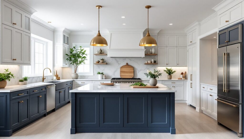
The island also bridges cabinetry and countertops. If your perimeter cabinets are white, a contrasting island color (deep navy, charcoal, or warm terracotta) creates visual separation and defines the island as its own element. If your perimeter is already dark, matching or complementing the island prevents visual overwhelm.
Lighting matters enormously. A color that looks muted under warm incandescent bulbs might appear bright and cool under daylight-balanced LED fixtures. Grab paint samples and observe them under your actual kitchen lighting at different times of day before committing.
Classic Neutral Kitchen Island Colors
Neutrals remain the safe choice for good reason: they age well, pair with almost any aesthetic, and don’t overwhelm smaller kitchens.
White and Cream Finishes
White is the most versatile kitchen island color. Pure whites (bright, no undertone) work in modern and transitional spaces, while creams with warm undertones suit traditional or farmhouse kitchens. Crisp whites reflect light and make islands feel airy, but they show fingerprints and require regular wiping, factor this into your maintenance expectations.
When painting, use a semi-gloss or satin finish rather than flat: it’s more durable and easier to clean. Quality paint designed for kitchens (like Benjamin Moore Advance or Sherwin-Williams ProClassic) resists stains and humidity better than standard interior paint. Expect to apply primer first, white over darker stains needs solid blocking.
Cream offers warmth without stark contrast. It pairs beautifully with natural wood countertops, butcher block, or warm stone. Creams can feel dated if the undertone leans too peachy or yellow, so test carefully. Soft whites with barely-there gray undertones (Benjamin Moore Simply White, Sherwin-Williams Alabaster) bridge white and cream without either extreme.
Gray and Charcoal Tones
Gray is the modern default, versatile, sophisticated, and calming. Light grays feel fresh and clean: mid-tone grays add visual weight without heaviness: dark charcoals create drama and anchor the room.
Light to mid-tone grays (think Sherwin-Williams Accessible Beige or Benjamin Moore Revere Pewter) work in almost any kitchen. They pair with stainless steel appliances, concrete countertops, or warm wood seamlessly. Darker grays (Charcoal Gray, Iron Ore) pair best with light countertops and adequate task lighting over the island surface to prevent the space from feeling shadowed.
Gray undertones matter. Some grays lean blue-gray (cooler, more modern), others lean warm gray or greige (warm, more transitional). Pull paint samples and compare them side-by-side in your space. A blue-gray island in a kitchen with warm oak perimeter cabinets can feel jarring. Greige bridges warm and cool tones more successfully in mixed-palette kitchens.
Bold Kitchen Island Colors That Make a Statement
Ready to go beyond neutral? Bold island colors, deep blues, forest greens, warm blacks, are trending as homeowners gain confidence with color and as paint formulations improve durability in kitchens.
Deep navy or dark teal creates a moody, designer-forward look. These colors anchor a light kitchen and pair beautifully with gold or brass hardware, white subway tile, and light wood or marble countertops. Navy absorbs light, so ensure your island has dedicated task lighting (recessed lights, pendant lights, or undercabinet strips). Avoid navy if your kitchen lacks windows or has poor natural light: it can feel oppressive.
Forest green or sage green brings organic warmth without the harshness of pure green. These colors work in transitional, farmhouse, and cottage-style kitchens and pair well with brass accents, natural wood, and white or cream countertops. Sage is softer and more timeless than bright kelly green, which can feel trendy and date quickly.
Home Bunch offers inspiration for interior design palettes including island color combinations paired with flooring and hardware, helping you visualize bold color choices in context.
Black or charcoal creates high contrast and works exceptionally well when your countertops or backsplash are light. Black islands suit modern, industrial, and contemporary kitchens. Keep in mind black shows water spots, dust, and fingerprints more than any other color: if you’re not prepared to wipe down daily, reconsider. Very dark colors also require excellent lighting to avoid a cave-like effect.
Warm blacks or off-blacks (with brown or green undertones) soften the starkness of pure black and feel slightly more forgiving in traditional or transitional spaces.
Warm and Earthy Kitchen Island Palettes
Earthy tones, warm tans, terracotta, ochre, and muted browns, bring natural, grounded energy to kitchens. These colors suit farmhouse, transitional, rustic, and Mediterranean styles exceptionally well.
Warm tan or caramel-toned islands pair beautifully with natural wood cabinetry, butcher block countertops, or warm-toned stone. These colors feel less sterile than cool grays and don’t show dust as obviously as darker tones. Tan works with both warm and cool accent colors (copper or stainless steel hardware), making it flexible for kitchens with mixed-tone finishes.
Terracotta and ochre bring vibrancy without the boldness of primary colors. Soft terracotta (muted, not bright orange-red) suits Spanish, Mediterranean, or eclectic kitchens. Ochre offers a golden, earthy warmth. Both work best with wood or natural stone and require careful lighting to ensure they don’t skew too orange or muddied.
Muted browns or taupe-browns create sophisticated, grounded islands. These colors hide stains well and feel less stark than cool grays. They pair with everything from natural wood to stainless steel. Warm brown works in nearly any kitchen without feeling trendy or shocking.
The Kitchn discusses kitchen design and color choices, including how warm earth tones integrate into functional kitchen layouts and work with various countertop materials.
When choosing warm tones, remember that undertones shift under different lighting. A tan that looks golden and warm under incandescent bulbs might appear muddy-yellow under cool LED light. Always test your chosen color in your actual kitchen under your actual lighting before committing to a full paint job.
How to Choose the Right Color for Your Kitchen Island
Start by assessing your existing palette. Pull the dominant colors from your countertops, flooring, backsplash, and perimeter cabinetry. Your island should either complement these or provide intentional contrast, but not conflict.
Consider lighting. Visit your kitchen at different times of day and under different bulb types. Daylight-balanced LEDs (5000K) reveal true color: warm incandescent (2700K) makes colors appear warmer and more muted. Most kitchens benefit from a mix: warm task lighting over the island, daylight-balanced ambient light elsewhere.
Test before committing. Paint large swatches (at least 12 inches square) of your top two or three color choices directly on your island base, if possible, or on foam board leaned against it. Live with these samples for three to five days, observing them in natural light, evening artificial light, and under different angles. Colors that look perfect in a paint chip can disappoint when scaled up.
Houzz provides a directory if you want guidance from someone experienced with color in your specific space and lighting conditions.
Think about maintenance. White and light colors show fingerprints and require frequent cleaning. Dark colors show dust and water spots. Mid-tones hide both better. If you have young children or pets, account for the reality of daily messes.
Don’t choose based purely on trend. Kitchen islands last 10–15+ years or more if painted and maintained well. A trendy hot pink might feel dated in five years. Stick with colors you genuinely love and that suit your home’s architecture and your lifestyle. You can always change accent hardware, stools, or bar décor more easily than repainting the island itself.